Top videos
Learn how to safely update your WordPress website with Plesk WordPress Toolkit

In this tutorial, we combine Elementor and Toolset to create a dynamic movie review website on WordPress.
You'll learn how to:
* Use dynamic content
* Create custom post types with Toolset
* Create custom fields with Toolset
* Build an archive template with Elementor
* Build a single template with Elementor
To learn more about Elementor and Custom Post Types:
https://elementor.com/custom-p....ost-types-and-elemen
Use Dynamic Content, as well as many other features that will help you edit and customize every part of your WordPress website: https://elementor.com/theme-builder/
Get Elementor: https://elementor.com
Join Pro: https://elementor.com/pro/
Get Toolset: https://toolset.com/

In this session, we will look at how to create or update custom field values in your REST API endpoints, the built-in authentication options for authenticating WP REST API requests, and how to test REST API routes and endpoints using a third party too.Presentation Slides »
---
View this video and others on WordPress.TV: https://wordpress.tv/2023/03/1....7/wp-rest-api-custom

Learn how to create Git repository using a local repository and to deploy files to the web site.
Try Plesk Onyx for free: http://hubs.ly/H04HvFJ0
Documentation and help: http://hubs.ly/H04KJTn0
Shipping Classes - WooCommerce Guided Tour

The Plesk eCommerce Toolkit powered by Ecwid is your solution to sell anything, anywhere, anytime. Build an online store in minutes and start selling right away, with 0 complexities. Find out more 👉 https://www.plesk.com/plesk-ecommerce-toolkit

In this tutorial, we’ll create a popup with a mouse track effect that you can add to your WordPress website using Elementor.
You'll learn how to:
✔︎ Create a mouse track effect animation
✔︎ Use position absolute
✔︎ Set conditions and triggers
Note: Mouse track effects do not work on mobile or tablet because they don’t use a mouse.
Read more on Motion Effects here: https://elementor.com/blog/int....roducing-motion-effe
Get Elementor Pro: https://elementor.com/pro/

In this tutorial, we'll go over how to hide a column in Elementor 2.5.
Learn More: https://elementor.com/blog/int....roducing-flexible-la
Get Elementor Pro: https://elementor.com/pro/

In this tutorial, you will learn how to master the Plesk SEO Toolkit. This toolkit provides all you need to get your business found online and improve your search engine rankings by testing, analyzing, and monitoring not just your website but also your competitors.

WordPress 6.2 introduces an exciting new feature for block themes: the WordPress Style Book! Learn how to find and use this valuable tool with your next WordPress block theme.
---
View this video and others on WordPress.TV: https://wordpress.tv/2023/03/2....9/how-to-use-the-wor

Elementor Template Library gives you access to over 100 designer-made page layouts, and 100's of pre-made blocks.
In this video, I'm going to show you how to use Elementor Template Library.
Get Elementor: https://elementor.com/

Defining the very basic settings of a website can be quite time-consuming.
With Elementor's Site Settings panel, you'll find many site-wide configuration tools. This way, you can stay inside Elementor, and have one place to set all of your site settings.
Get Elementor: https://elementor.com/
Get Elementor Pro: https://elementor.com/pro/
In this tutorial, we examine several responsive web design challenges and explore various ways to solve them elegantly using Elementor.
Tip #1. Responsive Design Begins and Ends With Correct Planning.
In this business, no one in their right mind would set off on a project without a plan, a draft or sketch. The more forethought and planning you can invest in the design process, the better you will be able to anticipate the technical problems and adjust your ideas accordingly.
Tip #2. Positioning Elements for Mobile Responsive View
When it comes to correctly positioning sections for mobile responsive view, we suggest avoiding setting values in pixels. Setting values in percent (%) or in EM keeps them relative to the overall screen size. Thanks to the responsive mode, we were able to conclude that we should set the padding to 17% either side of the text widget, in our next example, so that we get similar positioning in both desktop and mobile view.
Tip #3. Responsive Design: A Horizontal Approach
Traditionally, web design is a vertical process, which is why many designers prefer to complete the design of the entire page for a single device before, trying to make the same design work as well on the next device. An easier way to go about this is to design our views horizontally, one section at a time, across all our devices as we go along.
Once we have made sure that section looking the way we want it to in Desktop, Tablet, and Mobile views, we can move on to the next. Where possible, duplicate sections, columns or widgets, and update the relevant content; re-use them as foundations to build the other similar elements on the page.
Tip #4. Change / Position Background Image
Certain background images, like that of the example below, may look great in the desktop view. However, it doesn’t take much experience to see how it wouldn’t work well when viewing the site on a mobile screen.
Tip #5. Create Alternative Section
As promised, we are only too happy to share our experience and insight with our community, who will no doubt be familiar with our next example. Well within the top area of our home page, we needed to come up with a solution to the 3-column text section. Rather than having this appear as 3 boring rows of text in Mobile view, we decided to create an alternative section, with the text inside a slider widget.
Read the full post: https://elementor.com/blog/responsive-web-design/
Get Elementor: https://elementor.com
Get Elementor Pro: https://elementor.com/pro/
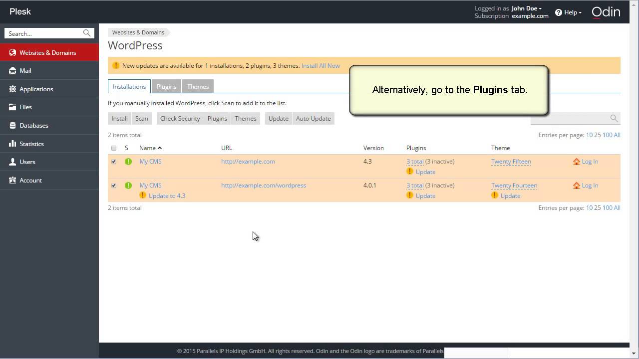
This Plesk video shows you how to use the WordPress Toolkit in Plesk 12.5 Also show you how to secure WordPress instances, install and remove themes. By the end of the tutorial you will have created a functional website, added a database, etc
For more information: www.plesk.com

This is a very basic tutorial to how the Elementor page builder works. It explains how to change the style options on sections and columns to customize your page design.
Get Elemenor free forever: https://elementor.com/

Find out how to change your account email address WordPress.com. Our step-by-step video will walk you through it, and it's easier than you'd think!
For more information, visit our dedicated support page: https://en.support.wordpress.com/email-address/
For more information about customizing your WordPress.com site, or other support questions, visit WordPress.com Support:
http://en.support.wordpress.com
For more information about creating a website or blog with WordPress.com, visit: http://www.wordpress.com/create
To enable the Jetpack plugin for your WordPress site: http://www.jetpack.com
Follow WordPress.com on Twitter:
https://twitter.com/wordpressdotcom
Get Updates from WordPress.com on Facebook:
https://www.facebook.com/WordPresscom/
Shipping Options - WooCommerce Guided Tour
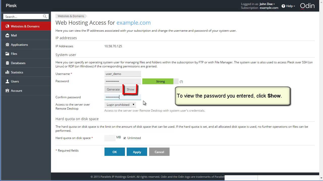
How to change subscription password

Plesk Video. Shows you how to configure spam protection for a mail account.
The Cover block allows you to display text and other content on top of an image or video. It is a great block for headers, banner-style displays, call-to-actions, and more.
In this session, we are going to use the Cover block to create a
- Call-to-action
- Parallax Images
- Video Banner
- Window effect
- Header
---
View this video and others on WordPress.TV: https://wordpress.tv/2022/10/1....3/uncovering-the-cov
