- Video Tutorials for Plesk 12.5
- Video Tutorials for Plesk Onyx
- Plesk Obsidian Use Cases
- WordPress Getting Started
- WordPress Using the Block Editor
- WordPress Customize your Site or Blog
- WordPress Site Marketing
- WordPress Monetize Your Site
- WordPress Domains and Email
- WordPress Manage Your Account
- WordPress Plugins
- Learn WordPress tutorial
- Elementor tutorials - Design & Layout Collection
- Elementor tutorials - WooCommerce Collection
- Elementor tutorials - Integrations Collection
- Elementor tutorials - Dynamic Design Collection
- Elementor tutorials - Theme Builder Collection
- Elementor tutorials - Template Library Collection
- Elementor tutorials - Responsive Collection
- Elementor tutorials - Popups Collection
- Elementor tutorials - Motion Effects & Animations Collection
- Elementor tutorials - Forms Collection
- Plesk WP Toolkit
- Plesk WordPress Toolkit
- WooCommerce How To
- Other
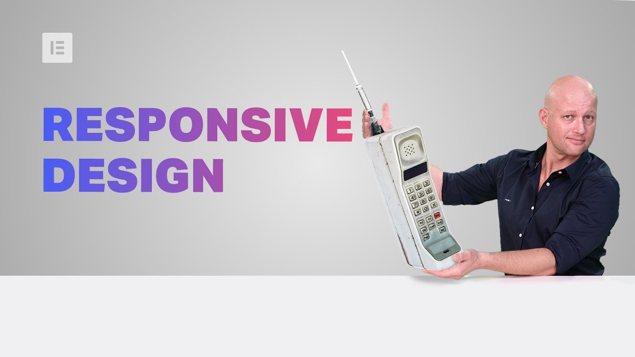
Making Your Sites Tablet and Mobile Friendly With Elementor
Join Ziv Geurts, Designer & Elementor’s Lead Educator, for a step-by-step walkthrough on how to use Elementor’s responsive settings to make sure your sites look great on tablet and mobile devices. The demo site is built with Elementor Pro, but the webinar will cover many topics relevant to all users.
6 Takeaways:
✓ Optimize and style navbar hamburger menus for tablet and mobile [PRO]
✓ Use Elementor’s responsive settings to create device specific designs
✓ Control column width and alignment per device
✓ Use relative units that scale better on devices, such as EM and %
✓ Optimize your Global Fonts for different viewports
✓ Manage Motion Effects for tablet and mobile devices [PRO]
Links mentioned in the Webinar:
1. How to Use Column Alignment: https://youtu.be/htUvG2Y5vaY
2. How to Use Motion Effects Viewport Settings: https://youtu.be/0pjPb8orwXM
3. Global Colors & Fonts Webinar: https://youtu.be/OvETB43I7_w
Don’t forget to subscribe to our channel!
Get Elementor: https://elementor.com/
Get Pro: https://elementor.com/pro
TIMESTAMPS:
00:00 Introduction
01:52 Site overview on tablet & mobile devices
03:30 Optimize & style the navbar hamburger menu for tablet and mobile
06:51 Tweak the header for mobile, device icons & alignment
09:30 Create device specific layouts using column width & responsive visibility
12:50 Optimize your global fonts for different viewports, understand default behavior & use EM to save time
18:28 Build a simple 2 column, text and image design & apply motion effects with mobile in mind
24:28 Tweak your buttons per device & understand the impact of changing values with settings that don’t have device icons
26:04 PX vs. % use relative units that scale better on devices
27:37 Applying Elementor’s responsive settings to create a custom footer layout for tablet and mobile


![Create a Button to Trigger an Onclick Popup in Elementor [PRO]](https://i.ytimg.com/vi/-29XXbJLnQM/maxresdefault.jpg)
![Create a Popup in Elementor: Step by Step [PRO]](https://i.ytimg.com/vi/2lPoObvlB8I/maxresdefault.jpg)

![Create Responsive Image Hotspots with Elementor [Advanced Tutorial]](https://i.ytimg.com/vi/GlwuG8DAaDA/maxresdefault.jpg)


